BITE ME
A bold hot sauce identity blending provocative copy, expressive illustration, and colorful packaging.
00

Goal
The hot sauce category is crowded with brands relying on familiar flames, peppers, and extreme-heat clichés. BITE ME needed a visual identity that could stand apart on the shelf while supporting multiple flavors, heat levels, and future product extensions without losing its personality.
solution
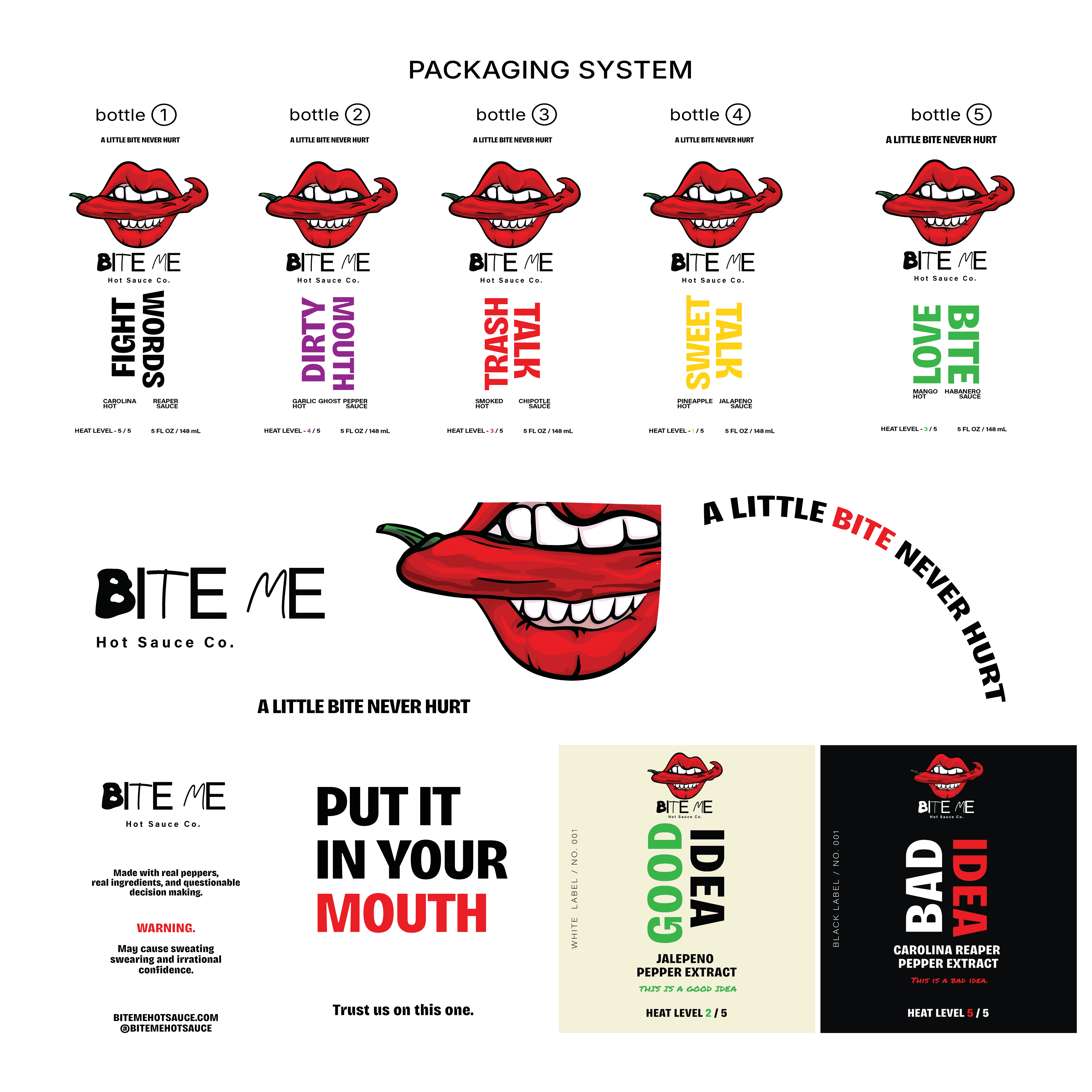
I developed a bold identity built around provocative humor, expressive illustration, and a flexible packaging system. A custom mouth-and-pepper mark anchors the brand, while distinct flavor names, typography, and color coding give each sauce its own personality within a consistent visual system.
BITE ME began as an exploration of how a hot sauce brand could feel playful and provocative without falling into the visual clichés commonly associated with extreme heat.
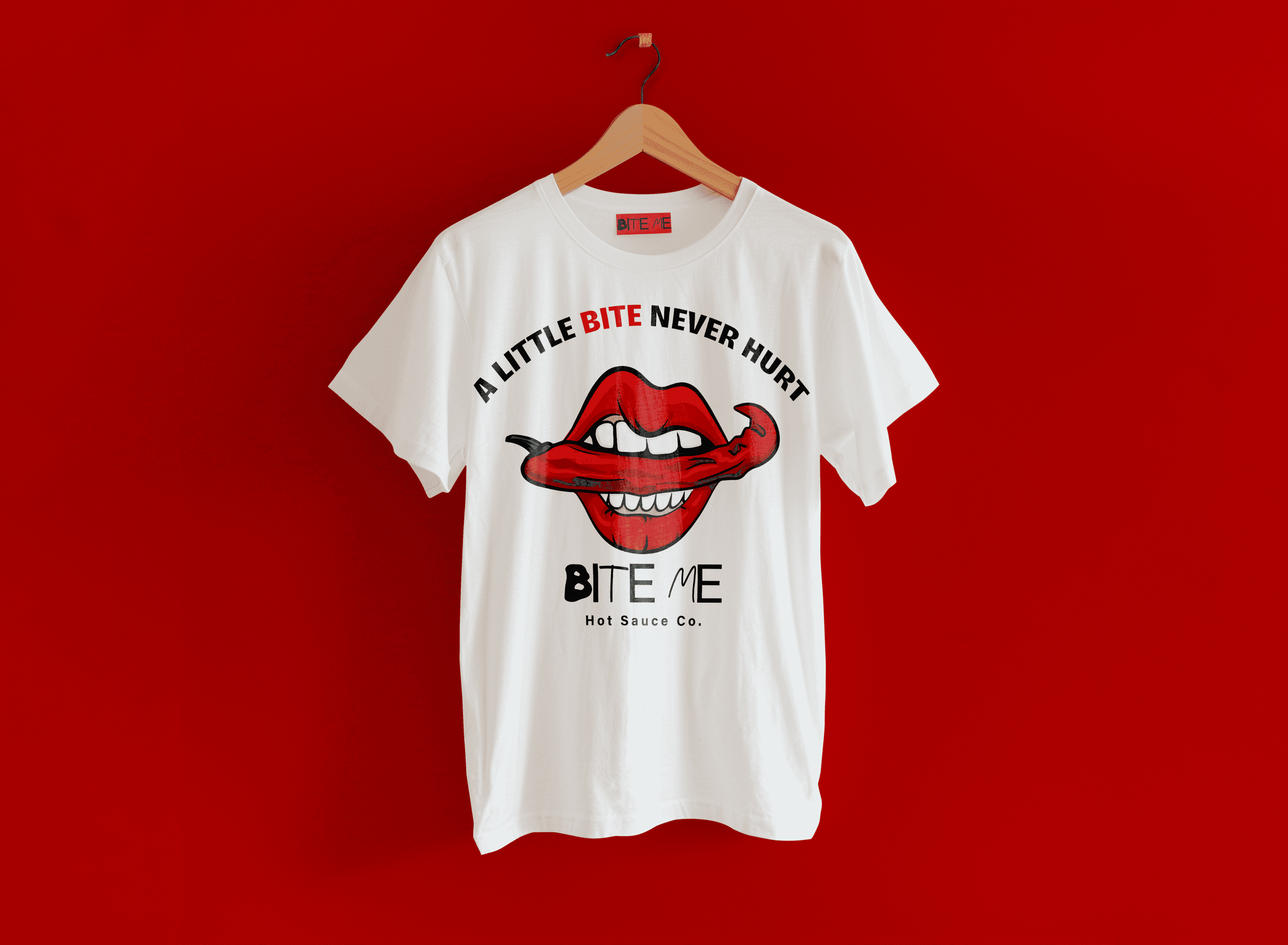
I built the identity around an illustrated mouth biting into a red pepper, creating a recognizable mark that captures the attitude behind the name. The visual language pairs expressive illustration with bold typography, a limited core palette, and irreverent copy such as “A Little Bite Never Hurt” and “Put It In Your Mouth.”
The packaging system expands the identity across five core flavors, using color and naming to give each product its own personality while maintaining a consistent structure across the collection. The system was then extended into specialty products, shipping packaging, advertising, and merchandise to explore how BITE ME could function as a complete consumer brand.
Role: Brand Designer & Creative Director
Scope: Brand Identity, Illustration, Packaging, Art Direction & Campaign Design
year
2026
timeframe
16 days
tools
Adobe illustrator, Adobe Photoshop
category
Personal Project
01

02
03
04

05

06

07

08